

Mobile-First Web Design: Why Your Website Needs to Work on Every Screen
Your potential customers are doing exactly the same thing.
That’s why having a website that works well on mobile devices is no longer optional. It’s an essential part of modern website design.
What is responsive web design?
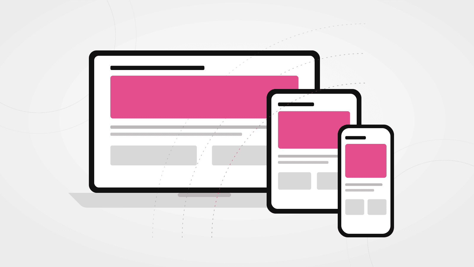
Responsive web design is an approach to building websites that allows their layout and content to adapt to different screen sizes.
Rather than creating separate websites for desktop computers and smartphones, a responsive website adjusts its layout automatically.
For example:
- A three-column layout on a desktop might become a single column on a phone.
- Navigation menus may become a compact mobile menu.
- Images resize to fit the available screen.
- Text and buttons adjust to remain readable and accessible.
The objective is to provide a consistent and comfortable experience regardless of the device being used.
Why does mobile-friendly design matter?
Better user experience
Visitors shouldn’t have to zoom in, struggle with tiny buttons or scroll sideways to read your content.
A well-designed mobile website makes it easy to find information, browse services and contact your business.
Search engine visibility
Google primarily uses the mobile version of websites for indexing.
If your mobile website is missing important content or has technical problems, this can affect how effectively Google understands and indexes your pages.
More opportunities to generate business
Imagine someone searching for a plumber, restaurant or professional service while out and about.
If your website is difficult to use, they may simply choose a competitor.
A clear mobile experience makes it easier for potential customers to take action.
Five things to check on your website
If you already have a website, try checking it on your own smartphone.
Pay particular attention to these areas:
1. Navigation
Can visitors easily find the main menu and understand where to go?
2. Text size
Is the content comfortable to read without zooming?
3. Buttons and links
Are buttons large enough to tap accurately with a finger?
4. Images
Do photographs resize properly without becoming distorted or taking over the screen?
5. Contact information
Can visitors easily find your telephone number, email address or enquiry form?
Mobile-first versus responsive design
Responsive design ensures that a website adapts to different screen sizes.
Mobile-first design takes the approach a step further by considering the mobile experience from the beginning of the design process.
This encourages more thoughtful decisions about content, navigation and functionality.
It doesn’t mean sacrificing the desktop experience. It means ensuring that the website works well on smaller screens before expanding the layout for larger devices.
Don’t just shrink your desktop website
One of the biggest mistakes in website design is treating the mobile version as an afterthought.
Simply shrinking everything to fit a smaller screen doesn’t necessarily produce a good experience.
Good mobile design involves considering what information visitors need, how they navigate the website and what actions you want them to take.
Is your website letting you down on mobile?
I design and develop responsive websites that look professional and work effectively across desktop computers, tablets and smartphones.